The Twins hit 1,424 home runs in their 21 seasons at Metropolitan Stadium. Friday morning at the Mall of America rotunda, on the grounds where that ballpark once stood, the organization felt it hit another one out of the park with the reveal of its first complete brand refresh in 35 years.
Saying the new look is "inspired by the past" and "built for the future," the Twins rolled out a baseball diamond-shaped catwalk to unveil the fresh design.
Four jerseys, a new "M" cap logo with four-pronged "North Star" and a revamped "TC" insignia were all part of the showcase. One of the jerseys can be worn home or away with white or gray pants.
"Our organization is incredibly aware and tremendously proud of our franchise," club President and CEO Dave St. Peter said. "But we also recognize we operate in a different environment today. It's highly competitive. We have in our mind an opportunity to push the brand forward in all kinds of ways."
Friday's event, nearly two years in the making, St. Peter said, featured players Luis Arraez, Byron Buxton, Jose Miranda, Jorge Polanco and Joe Ryan modeling the new uniforms.
• The new primary home uniform features a red "Twins" script stitched on a white base and navy numbers.
• The primary road uniform is pinstripe gray (for the first time since 2009) with red numbers and block-lettered "Minnesota" on the chest.
• In a twist, the Twins also revealed a dark navy blue alternate home/road uniform with white lettering and red numbers designed to be worn with white (home) or gray pinstripe (road) pants.
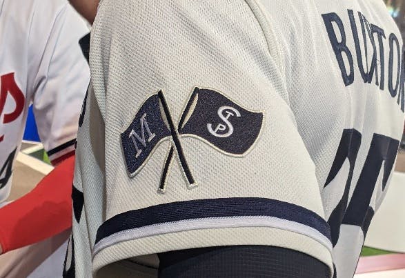
• The starkest change is the home alternate uniform. It's the only two-color outfit in the new rotation, with navy "Twin Cities" script across a cream-colored top. There's also a crisscrossed flag emblem on the left sleeve representing the neighboring cities.
"This is my favorite," said Buxton, who wore the home alternate Friday. "We lost cream four or five years ago, so to be able to bring it back and incorporate both St. Paul and [Minneapolis] with the 'Twin Cities' across the chest is very unique and shows the unity that the towns have together."
Buxton said he first saw the designs about two months ago.
"It was all about keeping my mouth shut," he said. "It's not old-school anymore, it's more new-school. For us, it was bringing in something different to express who we are as a team and this was a great way to do it. The little things that separate us. Something we haven't had."
As fans, packed three stories high in the mall's rotunda, waited for the reveal, the past was not lost on anyone. DJ Matty Matt bumped rapper T.I.'s "What You Know" — Joe Mauer's walk-up song for his entire Twins career.
The new "M" cap logo also looks conspicuously like the "W" logo the Washington Senators used before moving to Minnesota in 1961. That, however, was not an official designation by Minneapolis-raised graphic designer Matthew Wolff, who brought the entire vision to life.
"A happy accident," he said with a grin. "We looked at all the current Twins marks, some designed in the 1960s, some in the '80s, some updated since then. We looked at the whole suite of … uniforms and what we could keep and what we could retire. We wanted something that would last for generations."

Traditionally it's starting pitchers who get to decide what uniforms are worn for each game, and Ryan is already plotting his 2023 plans.
"I was customizing some gloves the other day and it was hard to decide," he said. "I might pop a little more red. There's some red in there. I can still get away with that. The pinstripes with the solid tops just stick out."
Home or away, it will be a new look that for many was long overdue.
"It was time," St. Peter said. After 35 years "trying to find a balance between paying homage to the history but also driving a new level of relevance amongst a younger fan base. And maybe bring some non-fans to the table."


